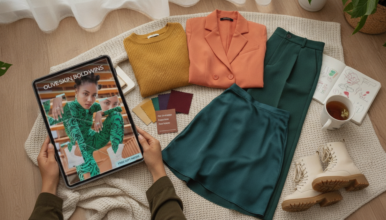
Olive skin can look striking in color, but “safe” shades often read flat—or slightly sallow—when undertone, depth, and contrast aren’t doing the heavy lifting. The good news: olive tones usually look best when color looks intentional. That means either crisp and clean (clear whites, inky darks) or rich and saturated (jewel tones, bold warms), rather than hazy mid-tones that blend into the skin.
If you want bolder outfits without a bigger closet, this guide breaks olive undertones into practical lanes, highlights repeatable color families, and turns everything into quick outfit formulas and capsule-wardrobe building blocks. For a deeper, step-by-step version with ready-to-use outfit templates, see Olive Skin, Bold Wins – Olive Skin Tone Color Guide eBook, Styling & Wardrobe Colors, AI Prompts for Outfits & Capsule Wardrobes.
Olive skin often carries a subtle green/gray cast under the surface. It can read warm-leaning (golden), cool-leaning (ashy), or even shift depending on lighting. That complexity is why many “universal” neutrals—beige, dusty taupe, and some creamy off-whites—can mute olive skin and make it look less even.
Two variables usually matter most when choosing flattering colors:
A helpful mindset: aim for colors that look deliberate—either crisp and clean, or rich and saturated—rather than smoky, dusty mid-tones that echo olive’s natural green/gray cast.
Lighting can trick the eye, so compare fabrics near your face in daylight and take a quick photo. You’re looking for the shades that make your complexion look clearer and your under-eye area look more rested.
If you want a quick reference on undertones and what they mean, the American Academy of Dermatology Association is a reliable place to start.
Olive skin often shines when color has clarity and depth. These families are repeatable “wins,” especially near the face (tops, scarves, jackets, earrings).
For color-family terminology and how shades are categorized, Pantone Color Institute is a helpful reference point.
Olive-friendly wardrobes tend to work best with deeper, cleaner neutrals rather than light, hazy ones. Start by testing these near your face:
If beige and taupe are tricky, try swapping to:
If you’re dialing in your look for photos, quick de-puffing and cooling can help your complexion look more even before you test colors near your face; an easy add-on is the Ice Roller for Face & Eyes – Skin Tightening Facial Massage Tool.
| Olive type | Anchor neutrals | Statement colors | Bridge shade | Easy accessory metals |
|---|---|---|---|---|
| Warm-olive | Espresso, deep warm cream, ink navy | Tomato red, rust | Forest green | Gold, bronze |
| Cool-olive | Charcoal, optic white, black | Cobalt, berry/wine | Deep teal | Silver, gunmetal |
| Neutral-olive | Espresso, charcoal, crisp white | Emerald, magenta | Deep olive | Mixed metals |
Olive Skin, Bold Wins – Olive Skin Tone Color Guide eBook, Styling & Wardrobe Colors, AI Prompts for Outfits & Capsule Wardrobes is designed for anyone with olive undertones who wants colors that look crisp, bright, and intentional—especially when typical “safe” neutrals feel off.
Muted yellow-beige or gray-beige can echo olive skin’s natural green/gray cast, making the complexion look flatter. Clearer neutrals (espresso, charcoal, ink navy, crisp white) and richer beige alternatives like deep camel or clearer mushroom-gray usually look brighter.
No—olive can be warm-leaning, cool-leaning, or neutral. Compare true white vs. cream, silver vs. gold, and cobalt vs. mustard in daylight to see which options make your skin look clearer.
Try teal, emerald, cobalt, or wine—these saturated shades tend to flatter olive undertones without feeling costume-y. Start with one item near your face (a top or scarf) and pair it with a dark neutral bottom for an easy, balanced look.








Leave a comment